


1.2: Histograms, Box Plots, Outliers, and Standard Deviation
Introduction to Histograms
Histogram: a bar graph for quantitative data
The horizontal axis is divided into classes
Each class needs to cover the same range of values
Generally, 5-7 classes is a good minimum
The more classes, the more detail/nuance shown
The vertical axis measures how much data is in each class
The bars must be touching
If a data point is on the break of a class group (on a tick mark on the x-axis), it is included in the right bar
Frequency histogram: a histogram showing the number of data points
Relative frequency histogram: a histogram showing the percent of data
Can be made by taking the frequency in each class and dividing it by the total number of data points
The center is generally found by estimation, especially if only a graph is given
A histogram displays how many pieces of data are in each class
Histograms must have
Consistent scales on both axes
Labels for both axes
A break on the x-axis if it does not start at 0
The y-axis starting at 0
Outliers
Data points are considered outliers if they lie…
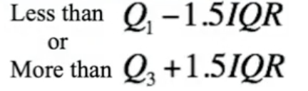
Eg. data set: 18, 19, 13, 2, 15, 19, 15, 31, 17, 16, 29
Q1 = 15
Q3 = 19
IQR = Q3 - Q1 = 4
Q1 - 1.5(IQR) = 15 - 1.5(4) = 9 → anything below 9 is an outlier
Q3 + 1.5(1QR) = 19 + 1.5(4) = 25 → anything above 25 is an outlier
So, 2, 29, and 31 are outliers
Choosing Relevant Measurements
Mean and Standard Deviation
Mean is the numerical standardized average of a set of data
Standard deviation is the spread of data about the mean
Standard deviation uses the same units as the original data
Skew and outliers influence both mean and standard deviation
Skew: the extent to which a graph is pulled to one side or centered around the middle
If skew/outliers are present in a data set, this means that mean and standard deviation should not be used
These measurements work well when data is approximately symmetrical with no outliers
Median, Quartiles, Range, and IQR
Resistent to outliers
These measurements work well when data is skewed and/or contains outliers
Measuring the Spread of Data
Range = maximum - minimum
IQR = Q3 - Q1
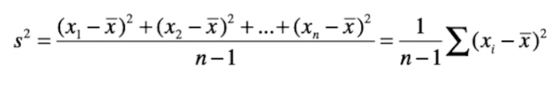
Standard Deviation
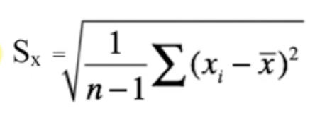
x̄ = mean
Standard deviation measures the rough average distance between each point and the mean
Larger standard deviations indicate that there is more data further from the mean
Moderate standard deviations indicate that data is moderately spread around the mean
Smaller standard deviations indicate that there is more data clumped closer to the mean
Variance
Variance is also equal to the square root of standard deviation
Remember to always plot data; measures of spread and center only display specific facts about a data set, but graphs give the best overall pictures of distributions