


IELTS Academic Writing Prep
Hello!
I’m XinD, and I’m currently preparing for my IELTS next year. Despite the fact that I’m pretty good at writing overall, I had a bit of a rough time prepping for writing lol, thus the IELTS Writing Prep is born.
Check out my German series here >>> https://knowt.io/folder/875ee727-dce7-49d6-8fb2-b90d8327ead0
Do note that this is a work-in-progress.
Good luck!
References:
IELTS Writing Task Tips by Liz**: Website
Task 1: Overview**: Website
🦊 IELTS Writing Format
⌛ Time allocated: 60 minutes
🌼 Number of sections: 2
⏳ Time distribution for each section: Task 1 (33%) -- 20 minutes
Task 2 -- 40 minutes
Click >> HERE **<< for a tutorial on the interface of computer-based IELTS writing.
🥪 IELTS Task 1 (33%)
Task 1 is a description of information in the form of either a diagram, pie chart, bar chart, table, map, or a line graph.
It is advisable to write around four paragraphs here.
1st PARAGRAPH -- Introduction
2nd PARAGRAPH -- Overview
(For bar charts, pie charts, line graphs, tables, and maps = a summary of the most and least amount + the rise and fall in general)
(For diagrams = the first few steps of the process)
3rd PARAGRAPH -- Write about the rise and fall of each component / Put the primary key figures
4th PARAGRAPH -- Compare and contrast the components / Put the secondary key figures
PREPARATION STEPS
Our strategy is to save as much time as possible. Don’t forget that you only have 60 minutes for both sections. Task 2 is worth a lot more points, so don’t dwell too long on Task 1.
Step 1: Read a bunch of model essays specifically on Task 1
(Click >> Here << and scroll down for some sample answers on Task 1)
Step 2: Establish and memorise a few model introductions and overviews to save time.
Step 3: Establish and memorise a few templates on the structure of the content to save time.
Step 4: Memorise a bunch of useful key words.
(Click >> Here << for IELTS Task 1 Vocabulary Flashcards*)*
Step 5: Practice, practice, practice!
INTRODUCTION TEMPLATES
Since I’ve provided the link for sample answers above, we’re now at Step 2! I have written and provided a number of introduction templates
**** NOTE TO SELF: Never forget to include the overview + Do not write a conclusion.**
The introduction consists of 1 - 2 sentences. You can just paraphrase the question and the title. If there are units (pounds, dollars etc.), remember to include this sentence: “Units are measured in xxx.“
📊 Bar Chart
The bar chart illustrates the (paraphrased question) from (time) to (time).
The bar chart provides data on the (paraphrased question) from (time) to (time).
The provided bar chart portrays the (paraphrased question) from (time) to (time).
The bar chart elucidates the (paraphrased question) from (time) to (time).
The bar chart depicts the (paraphrased question) from (time) to (time).
The bar chart indicates the (paraphrased question) from (time) to (time).
🥧 Pie Chart
The pie charts illustrate the (paraphrased question) from (time) to (time).
The pie charts provide data on the (paraphrased question) from (time) to (time).
The provided pie charts portray the (paraphrased question) from (time) to (time).
The pie charts elucidate the (paraphrased question) from (time) to (time).
The pie charts provide a comparative study on the (paraphrased question) from (time) to (time).
The pie charts depict the (paraphrased question) from (time) to (time).
The pie charts indicate the (paraphrased question) from (time) to (time).
📜 Diagram(s)
The diagram(s) illustrates the way / method / process / procedure / stages in which (paraphrased question).
The diagram(s) elucidates the way / method / process / procedure / stages in which (paraphrased question).
The diagram (s) depicts the way / method / process / procedure / stages in which (paraphrased question).
The diagram(s) depicts the (paraphrased question) from (time) to (time).
📈 Line graph
The line graph illustrates the (paraphrased question) from (time) to (time).
The line graph provides data on the (paraphrased question) from (time) to (time).
The provided line graph portrays the (paraphrased question) from (time) to (time).
The line graph elucidates the (paraphrased question) from (time) to (time).
The line graph depicts the (paraphrased question) from (time) to (time).
The line graph indicates the (paraphrased question) from (time) to (time).
📅 Table
The table illustrates the (paraphrased question) from (time) to (time).
The table provides data on the (paraphrased question) from (time) to (time).
The provided table portrays the (paraphrased question) from (time) to (time).
The table elucidates the (paraphrased question) from (time) to (time).
The table depicts the (paraphrased question) from (time) to (time).
The table indicates the (paraphrased question) from (time) to (time).
📌 Map(s)
The map(s) illustrates the (paraphrased question) from (time) to (time).
The map(s) provides data on the (paraphrased question) from (time) to (time).
The provided map(s) portrays the (paraphrased question) from (time) to (time).
The map(s) elucidates the (paraphrased question) from (time) to (time).
The map(s) depicts the (paraphrased question) from (time) to (time).
The map(s) indicates the (paraphrased question) from (time) to (time).
OVERVIEW TEMPLATES
An overview is crucial in IELTS Writing Task 1. You CANNOT forget to include it in the second paragraph, unless you have a diagram question.
The overview contains around 3 - 4 sentences. It is a summary of the pictorial information provided.
Before writing an overview, heed these TWO steps:
STEP 1 : Use linkers (Overall, To summarise, In summary, In brief)
STEP 2 : Write the main trend(s) or overall picture of what you see in the visual(s). Depending on the type of visual, ask yourself these questions:
Can you see an overall increase, decrease or fluctuation in the visual diagram?
Can you see very high or very low points?
Can you see more or less of something (E.g. more males, less females, more employed, less employed)?
Has the map or plan changed over time?
Have features been added or taken away?
What is the main relationship between the visuals?
Is there a predicted change that will happen in the future?
📊 Bar Chart
Overall, it can be seen that (info) produces the most (info) over this time period, whereas (info) has the least amount of (info).
💡 IELTS Sample Writing (Bar Charts)
Before we start writing, it is important to look for the key features. It’s around 2 - 5. These key features will be presented in your overview.
Sample 1
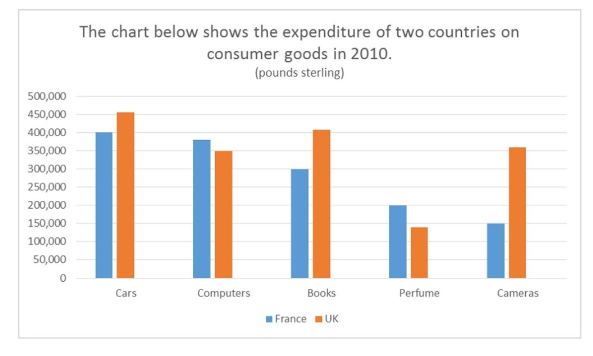
Key Features:
UK: most on cars (£450,000)
UK: least on perfume (under £150,000)
France: most on cars (around £400,000)
France: least on cameras (£150,000)
The UK spends more money on average compared to France
The most obvious gap was the expenditure on cameras.
The chart elucidates the amount of money spent on five consumer goods (cars, computers, books, perfume, and cameras) by France and the UK in 2010. Units are measured in pounds sterling.
Overall, the UK spent more money in comparison to France during the given time period. It was interesting to note that both the British and the French spent the most money on cars. In the UK, the least amount of money is spent on perfume, whereas in France, the least amount was spent on cameras. Additionally, the most significant difference in expenditure between these two countries was the amount of money spent on cameras.
Based on the data given, the people in the UK spent around £450,000 on cars, while the people in France spent roughly £400,000. Similarly, the British’s expenditure on books was notably higher than the French (about £400,000 and £300,000 respectively). In terms of cameras, there exists an exponential difference in the expenditures, with the UK spending roughly over £350,000 and France spending only £150,000.
The amount of money that the French expended on computers was slightly higher than the British (with the former spending over £350,000 and the latter spending exactly £350,000). In addition, France also boasted a higher expense on perfume (£200,000) as opposed to the UK (under £150,000). However, by comparing and contrasting the amount of expenses, it was observed that none of the countries spent a lot on perfume.
(237 words)
My answer (1) -- Ungraded
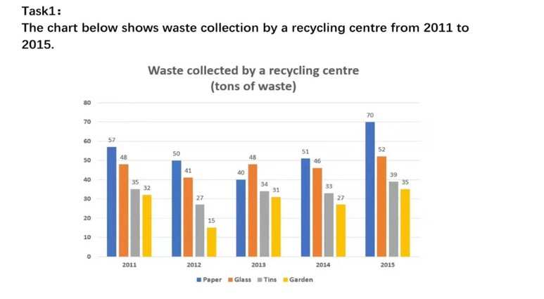
Key features:
Highest in all 5 years: Paper (2015, 70 tons)
Lowest in all 5 years: Garden (2012, 15 tons)
In general, waste related to gardens is the lowest.
In general, wasted paper maintains as the highest.
In 2013, glass exceeded paper with 48 tons
The bar chart illustrates the four types of waste (paper, glass, tins, and garden) collected by a recycling centre from 2011 to 2015. Units are measured in tons.
Overall, by comparing all four types of wastage throughout the given time period, paper comprised the highest percentage (70 tons in 2015), while waste from gardens was the lowest (15 tons in 2012). In relation, the amount of wasted paper was consistently at its highest peak for almost every year (the exception being the year 2013, in which glass exceeded paper with 48 tons), while garden-related waste was continuously at its lowest peak every single year.
Based on the data provided, the recycling centre collected about 57 tons of paper, 48 tons of glass, 35 tons of tins, and 32 tons of garden waste in 2011. In 2012, all four types of waste experienced a decrease, with paper still in the lead at 50 tons, followed by glass (41 tons) and tins (27 tons). However, the most notable decline was garden waste, which boasted an exponential drop from 37 tons in 2011 to 15 tons. In 2013, unlike the previous two years, glass became the most type of waste that was recycled (48 tons), whereas only around 40 tons of paper made it into recycling. Tins and garden remained relatively low (34 tons and 31 tons respectively).
In 2014, paper waste increased again with 51 tons, and the amount continued to elevate extensively in 2015 with a staggering 70 tons. Glass maintained its position as the second highest type of recycled waste from 2014 to 2015 with 48 tons and 52 tons respectively. Even though the recycling centre has also witnessed a growth in tins and garden-related waste for the remaining two years, the both of them continued to occupy the third and fourth positions, with the former growing from 33 tons to 39 tons, and the latter increasing from 27 tons to 35 tons.
(327 words)
My answer (2) -- Ungraded
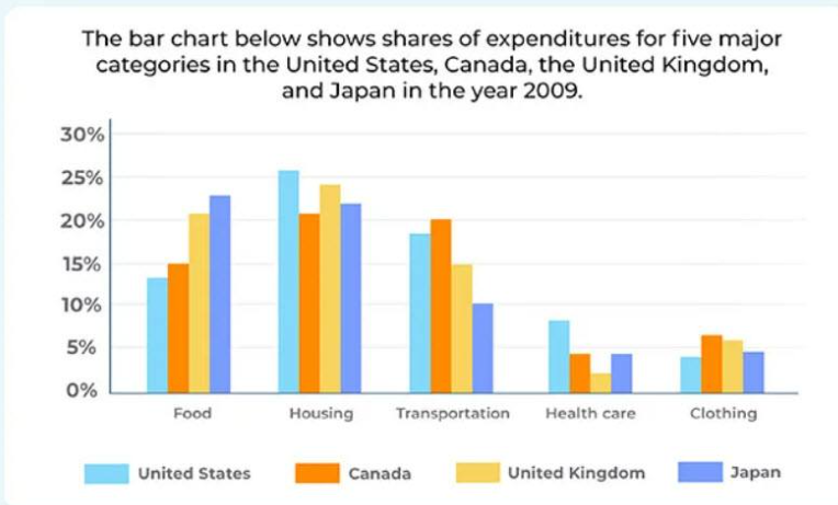
Key features:
Highest housing expense: USALowest housing expense: Canada
Highest food expense: JapanLowest food expense: USAHighest transportation expense: Canada
Lowest transportation expense: JapanHighest health care expense: USALowest health care expense: UK
Highest clothing expense: Canada
Lowest clothing expense: USAUSA: most on houses
UK: most on houses
Canada: most on houses
Japan: most on food
On average, all countries allocated the most percentage on food
On average, almost all countries allocated the lowest percentage on health care
The bar chart elucidates the percentage of expenses allocated for five types of expenditures (food, housing, transportation, health care, and clothing) in four countries (the United States, Canada, the United Kingdom, and Japan) in 2009. Units are measured in percentages.
Overall, all of the countries allocated the most percentage of money on food and the least on health care, It was also observed that food, housing, and transportation were the greatest expenses. Moreover, the Americans, Canadians, and the British spent the most on houses, while the Japanese spent the most on food. Besides that, those residing in Canada had a higher expenditure on transportation than the other countries, while those in America spent slightly more on health care than the other nations. In terms of categories, a comparison across all four countries indicate that the US allotted the most amount of money on housing and healthcare, and the least amount on food and clothes. Japan spent the most on food and the least on transport; Canada the most on transport and clothes, and the least on homes; and the UK the most on homes and the least on health care.
Based on the data provided, the people in Japan and the UK assigned over 20% of their money on food, whereas those residing in Canada and the US allocated between 10% to 15% only. Expenditures on housing were high, with all countries spending at least 20% and above. The percentages ranged from a moderate low of exactly 20% (Canada) to over 25% (the US), with the UK and Japan in between (both considerably higher than 20%). Expenses related to transport were notably high yet variable, with Canada standing at 20%, followed by the US (over 15%), the UK (15%), and Japan (10%).
In terms of healthcare, almost 5% to 10% of money were allocated from the Americans, while the rest allotted less than 5%. For clothing, Canadians and the British expended the most (both more than 5%), succeeded by the Japanese (exactly 5%), and the Americans (below 5%).
(338 words)
My Answer (3) -- Ungraded
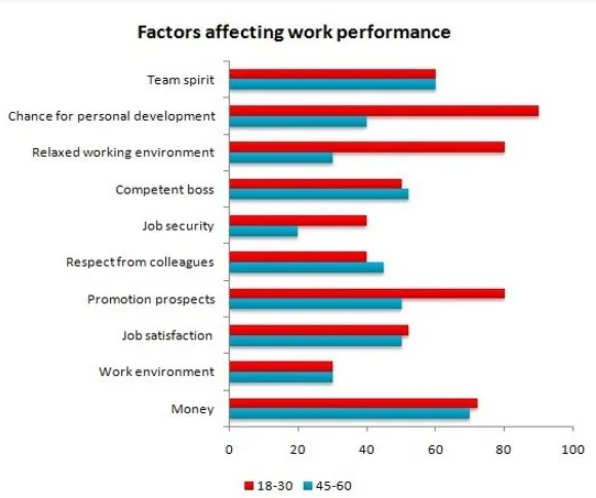
Key Features:
18 - 30 places the highest priority on chances for job development
45 - 60 places the highest priority on money
For 18 - 30, chances for job development, job security, a relaxed working environment, and money are quite huge priorities. The rest remain generally high throughout the graph.
For 45 - 60, everything is kind of mellowed down, but competent boss, promotion prospects, and job satisfaction are the same percentage, with money a bit higher.
Both age groups have the same percentage for team spirit and work environment. (they concur / coincide)
The bar chart illustrates the different types of factors that may impact the work performance of two age groups (18 to 30-year-olds and 45 to 60-year-olds). Units are measured in percentages.
Overall, there is a general congruity among the data. It was observed that 18 to 30-year-old employees place the highest priority on job development, followed by promotional prospects, a relaxed working environment, and money. In terms of the older employees, the data indicates a more mellow fluctuation, with money considerably preceding the remaining factors as the key component for job performance. Both groups share a similar level of emphasis on team spirit and work environment.
In terms of great similarities, for both ages, 60% prioritise team spirit in the workforce, and 30% concur the environment in which they work in are crucial for heightened job performances. Similarly, more than 60% of the young and the old perform well when money is a motivator. The reported figures are also similar for job satisfaction (55% for the younger and 50% for the older), capable employers (50% for the younger employees and 55% for their older counterparts), and respect from their co-workers (roughly 40% for those aged between 18 to 30 and approximately 45% for those aged between 445 to 60).
However, there are also significant contrasts presented in the data. More than 80% of 18 to 30-year-olds depend their job performances on whether there are opportunities for self-development, whereas only around 40% of their aged counterparts do so. Additionally, an environment that exudes calm and relaxing vibes would also impact about 80% of the younger employees’ work, while less than 40% of the older employees are affected by it. Moreover, younger people are prone to be influenced by promotional prospects and job security as well (about 80% for the former and roughly 43% for the latter). This is in opposition to the older people, in which a mere 45% and 20% seek promotions and job security respectively.
(326 words)
My Answer (4) -- Ungraded
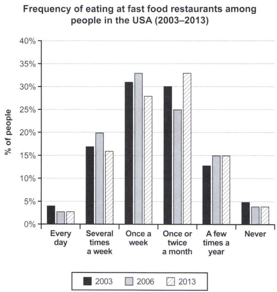
Key Features:
Most Americans still eat fast food the most around once a week or once or twice a month.
Once a week and once or twice a month for 2006 is the same as 2013
A few times a year -- same for 2006 and 2013
Never -- same for 2006 and 2013
Every day -- same for 2006 and 2013
2003 -- highest is once a week
2006 -- highest is once a week
2013 -- highest is once or twice a month
The bar chart elucidates how often Americans consume fast food in three years (2003, 2006, and 2013). Units are measured in percentages.
Overall, most Americans have a high tendency to frequent fast food restaurants either weekly, monthly, or bi-monthly, and there is a general undulating pattern throughout the given time period. In addition, similar figures show that people living in the US in 2003 and 2006 preferred to dine on fast food once a week, whereas in 2013, people preferred fast food either once or twice per month. Apart from that, the number of US residents who never ate fast food in 2006 and 2013 remain the same, likewise the ones who did every day.
As the years progressed, it was apparent that the US residents have lowered their daily consumption of fast food from almost 5% in 2003 to approximately 3% in 2006 and 2013. Similarly, the number of Americans who never ate fast food has also declined from 5% in 2003 to around 3% for the remaining two years. However, more and more people have opted for a few annual trips to fast food chains, causing a surge in the figures provided (13% in 2003 and 15% for 2006 and 2013).
Undulations and variations exist throughout the remaining data. The frequency of Americans eating fast food several times a week rose and fell (around 16% in 2003, 20% in 2006, and about 11% in 2013). Likewise, fast food restaurants had experienced a similar undulating surge from the Americans’ weekly consumption (just over 30% in 2003, around 33% in 2006, and roughly 28% in 2013). Interestingly, in 2006, fewer people chose to eat fast food monthly or fortnightly (25%) as opposed to the higher numbers in 2003 (30%) and 2013 (about 33%).
(293 words)
My answer (5) -- Ungraded
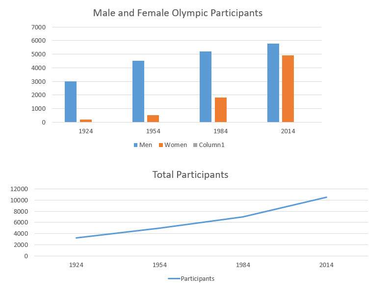
Key features:
Women participants are growing exponentially
Number of participants increased in general
Huge difference between males and females in 1924, yet the gap is closing in in 2014
Exceptionally major difference between males and females in 1954
The bar chart illustrates the number of male and female participants who participated in the Olympics for four selected years (1924, 1954, 1984, and 2014), whereas the line graph below indicates the total figure of Olympic participants throughout the given time periods.
Overall, regardless of the bar chart or the line graph, the data elucidates that more people have chosen to participate in the Olympics with the passing of each thirty-year mark. More significantly, female Olympic athletes have increased exponentially, and the gap between male and female Olympic competitors have narrowed as the years progressed.
In 1924, the disparity between male and female participants were extensive, with 3,000 men and roughly 100 women competing in the Olympics. Over the next 30 years, the Olympics remained as a male-dominant competition as indicated in the elevation of male athletes from 3,000 to about 4,500. However, the number of female competitors also rose slightly from 100 to around 500. In 1984, there was a more impressive growth in the female sector (more than 2,500) and the men maintained a steady increase (over 5,000). Finally, the once noticeable gap between male and female Olympic athletes was narrowed dramatically in 2014 as over 5,500 men and a whopping 4,900 women participated in the Olympics.
In terms of the total number of participants, there exists a stable growth every 30 years. The number of total participants were initially around 3,800 in 1924, and as the years went by, no decline was observed. In fact, the growth maintained a steady pace with more than 4,000 participants in 1954, about 7,000 in 1984, and an astounding 10,000 and more in 2014.
(273 words)
My answer (6) -- Ungraded
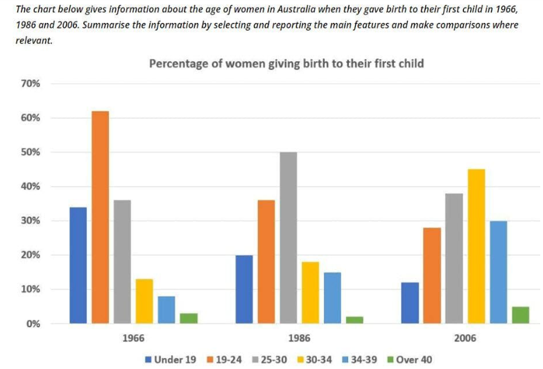
Key features:
1966 - Most women gave birth around 19 - 24
1986 - Most women gave birth around 25 - 30
2006 - Most women gave birth around 25 - 30
Based on the information above, the age range of women giving birth to their first child is increasing. Women choose to give birth at a later age.
Number of 30 - over 40 women who gave birth to their first child increased gradually.
Number of teen mums and 19 - 24 year old mums have decreased.
An undulation exists for 25 - 30 and over 40
The bar chart illustrates the fluctuations among Australian women of different ages who had their first child in three respective years (1966, 1986, and 2006). Units are measured in percentages.
Overall, women are choosing to become new mothers in the later stages of their lives. This is evidenced by the gradual increase of women who gave birth between 30 and over 40 years of age, while the percentage of women who became mothers at 24 years old and below had decreased continuously. Additionally, first-time mothers who are more than 40 years of age are still considerably rare, and that in general, most women still preferred giving birth to their first offspring around 19 to 34 years old.
In 1966, most women had their first child when they were in their early twenties (higher than 60%). Furthermore, more than 35% of women who were in their late twenties (25-30) and about 33% of women in their teens and tweens (under 19) were first-time mothers too. In contrast, women who are 30 years old and above were less likely to give birth during this era, with around 12% of them in their early thirties (30 - 34), roughly 8% of them in their late thirties (34 - 39), and less than 5% of them over 40. Multiple transformations were witnessed as the years progressed. The percentage of 19 to 24-year-old mothers plummeted exponentially in 1986, and it continued to decline in 2006 (about 36% and 29% respectively). Interestingly, mothers who were below the age of 19 went through a similar drop from more than 30% in 1966 to 20% in 1986 and around 11% in 2006.
On the other hand, more and more women in their early thirties and above decided to have their first baby. In 1986 and 2006, 30 to 34-year-olds almost quadrupled their numbers (11% to 19% to 45%), while women ages 35 to 39 more than doubled theirs (8% to 15% to 30%). Finally, there were observable yet differing undulations for women in 25-30 and over-40 age ranges in these final two years. The former had more than 35% in 1966, experienced a staggering escalation in 1986 (50%), and ended with a reduction in 2006 (39%). On the contrary, in 1966, the latter, who had 3%, dropped slightly to 2% in 1986, and increased to 5% in 2006.
(388 words)
My answer (7) -- Ungraded
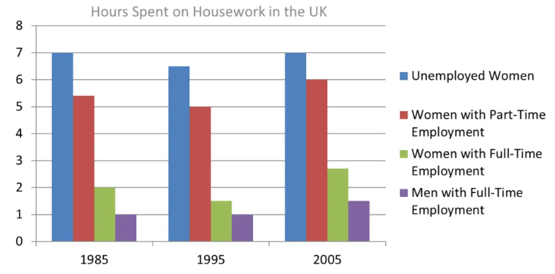
Key features:
Undulation for unemployed and part-time employment and women with full-time employment
Slight increase in men with full-time employment
Unemployed and part-time employment spent the most time on housework in comparison with full-time
More part-time women and full-time do housework more in 2005 compared to 1985 and 1995
The bar chart illustrates the duration that employed and unemployed British residents spent on doing housework in three respective years (1985, 1995, and 2005). Units are measured in hours.
Overall, a majority of unemployed women and women who hold part-time jobs spent the most time on household chores, while men and women in full-time employment spent the least amount of time. As the years progressed, undulating patterns could be observed in the women’s categories, specifically the unemployed and the employed, and more interestingly, there is a slight increase in the number of hours that full-time employed men spend on doing housework.
As aforementioned, there are undulations present in all the women’s categories. In 1985, women who stayed at home dedicated most of their time (7 hours) to household chores. That number dropped slightly to around 6 and a half hours in 1995, but reverted back to 7 hours in 2005. Similarly, women with part-time jobs did housework for more than 5 hours in the beginning, and after 10 years, it experienced a small decline of 30 minutes (precisely 5 hours), and yet in 2005, the number of hours increased rapidly to a total of 6 hours.
In contrast, women and men with full-time careers only committed a few hours to housework, regardless of the time period. In 1985, women allocated 2 hours and men allocated an hour for housework, which is a drastic 5 to 6-hour difference in comparison with the housewives and part-timers. In 1995, the men’s working hours remained the same, while notably, the women who worked full-time jobs lowered their numbers by devoting around a mere hour and a half of their time to household chores. Finally, after 10 years, the figures for both men and women with full-time employment rose (more than an hour for the former and more than two hours for the latter).
My answer (8) -- Ungraded
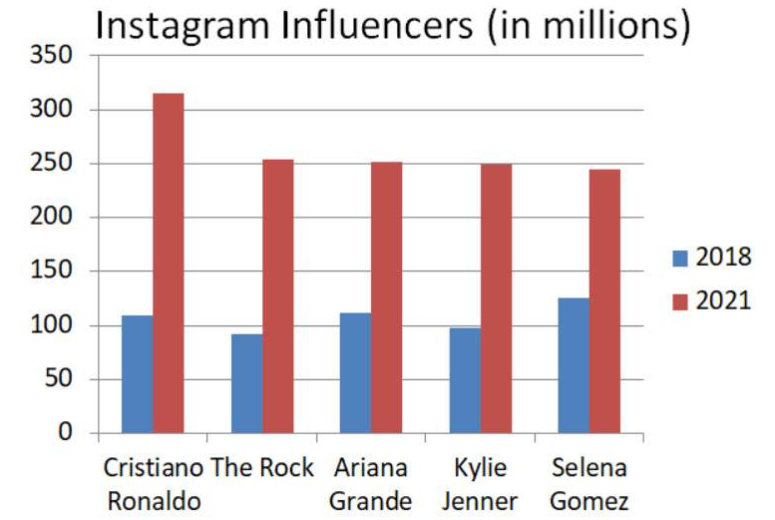
Key features:
All the influencers had a major elevation in terms of their earnings.
Selena Gomez earned the most in 2018
Cristiano Ronaldo earned the most in 2021
Ariana, and kylie had the same amount of earnings in 2021, while The Rock had a slightly higher amount of earnings than them.
The bar chart illustrates the amount of followers that five Instagram influencers (Cristiano Ronaldo, The Rock, Ariana Grande, Kylie Jenner, and Selena Gomez) attained in two respective years (2018 and 2021).
Overall, every influencer had experienced exponential elevations in their following. Additionally, upon comparing the data, it was observed that the difference in followers among the stars in 2018 were not as prominent as the data shown in 2021.
In 2018, all the influencers obtained a similar range of followers. Selena Gomez, being the one with the highest number of Instagram followers during that time, had about 130 million. Ariana Grande, being the second highest, had at least 110 million people following her, while Cristiano Ronaldo became the third highest at about 105 million. Kylie Jenner and The Rock, on the other hand, both had less than 100 million followers (about 99 million and 97 million respectively).
However, in 2021, a major rise occurred. Cristiano experienced the most dramatic influx of followers (around 320 million). Similarly, The Rock, Ariana, and Kylie almost doubled the number of people who followed them too (more than 250 million for the former and exactly 250 million for the latter two). The rise in Selena’s follower count was also impressive as she had managed to acquire around 249 million followers.
(215 words)
My answer (9) -- Ungraded
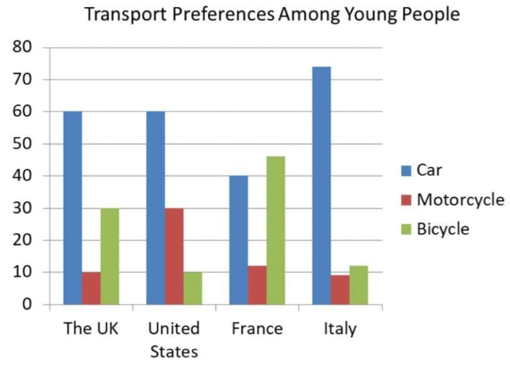
Key features:
Uk, Us, Italy prefer cars
France prefers bicycles slightly more than cars
In general, most countries do prefer cars
In general, all of them do not prefer motorcycles
US and Italy have an obvious lack of youngsters riding bikes
Uk, US have the same amount of youngsters preferring cars
Italy has the highest amount of youngsters who drive cars
The bar chart illustrates three types of transport preferences (cars, bicycles, and motorcycles) from the youngsters of four different countries (the US, the UK, France, and Italy). Units are measured in percentages.
Overall, all the young people greatly prefer cars over motorcycles. Specifically, young people from the United States, the United Kingdom, and Italy have the highest preference when it comes to cars. In addition, the youth living in the US and Italy do not enjoy riding bicycles. On the other hand, young people in France preferred bicycles a lot. In fact, the number of youngsters on bicycles are slightly higher than the youngsters who drive cars.
Based on the data, the UK and the US have immense similarities, especially in the numerical aspect. Exactly 60% of young people residing in the United Kingdom and the United States prefer to drive cars. In relation, it is interesting to note that the UK has the exact same amount of cyclists (30%) as the US has in motorcyclists (30%). Likewise,10% of youngsters in the UK drive motorcycles and 10% of American youngsters cycle.
The French and the Italians, on the other hand, have a vast difference when placed in comparison with each other. In terms of cars, there is a 30% difference between Italy and France (over 70% for the former and 40% for the latter). Apart from that, the Italians and French also differ greatly in terms of bicycles, with Italy at a mere 11% and France at a whopping 48%. However, despite their differences, these two countries share similar percentages in the number of young motorcyclists. France has about 11% of young people on motorcycles, whereas Italy is slightly lower by two percent (9%).
(284 words)