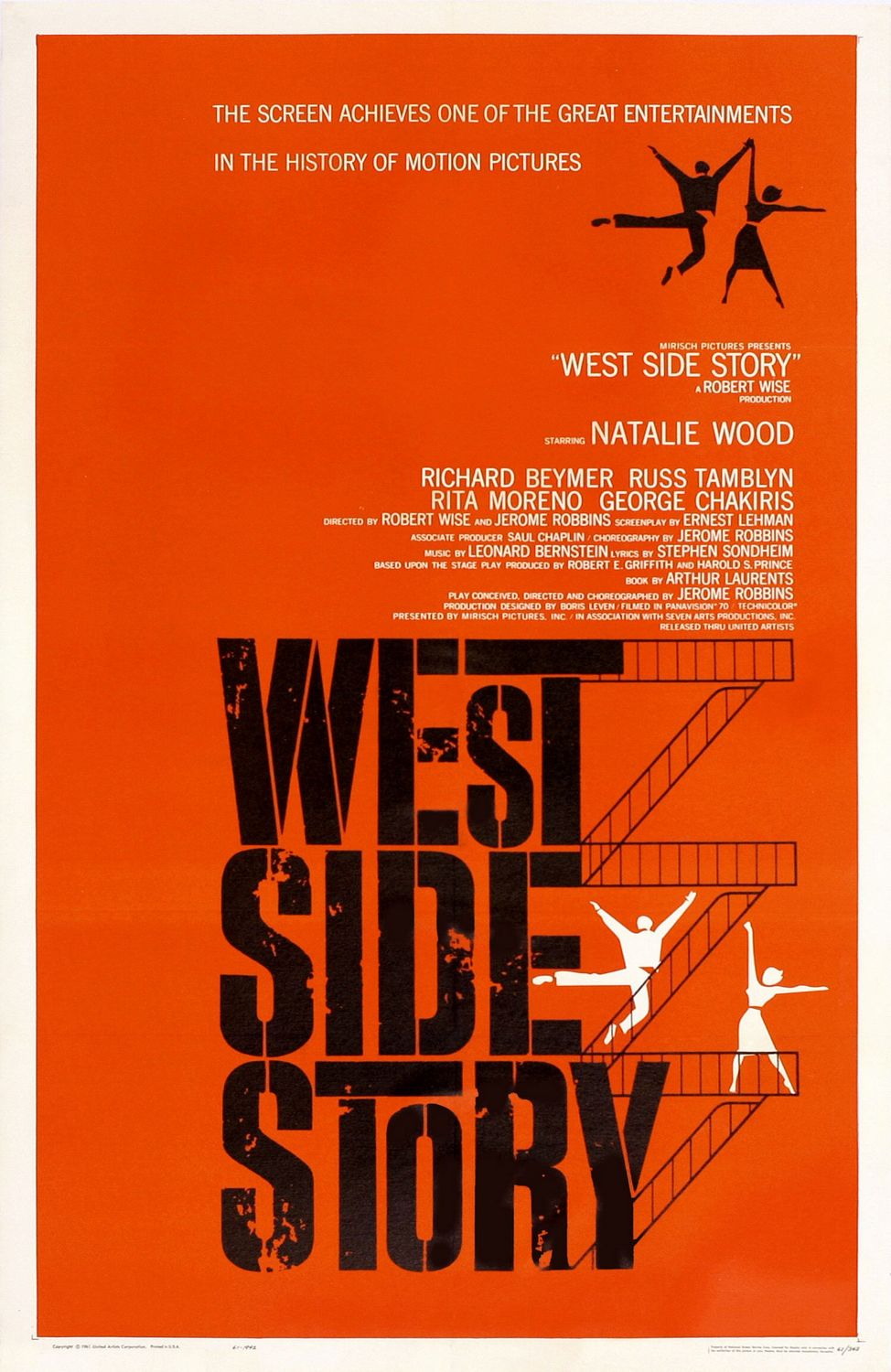
Purpose and function of the West Side Story poster
Advertise a movie musical and encourage people to see the film
It is retelling of Romeo and Juliet with tony and Maria and two rival gangs
Told through songs and dance
Tragic ending
Materials and techniques for west side story
Paper cut out shapes and silhouettes were combined with hand drawn typography
The screen printing process was used- means they force ink through a mesh screen onto paper. You can use stencils to create shapes by blocking the ink from getting onto the paper
Market and target audience
Aimed at musical fans
The bold, simplistic, urban style looked very contemporary at the time it was made.
This appealed to both young men and women because of the brightness and the energy in the poster
Style
This poster reflects style of Swiss graphic design in the 50s
He uses simple and geometric shapes and their symbolism to reflect this work
Saul uses a stencil technique to create the large text in the title
Imagery
Bass is famous for his use of simple silhouettes and symbolism.
In this case he is trying to create an urban setting
The fire escape runs down the right hand side of the title to communicate that the movie is set in Brooklyn.
The two figures with outstretched arms who are dancing look very energetic which appeals to the target audience
Layout
The top half is mostly small white text it’s names of the actors
The bottom half is mostly filled with the title
Their are four dancers, two black and two white
This represents the rival gangs
Lettering
Typography has been chosen carefully to reflect the urban theme and location
The font is uppercase and bold and looks stencilled (like graffiti)
Two Ts were extended as if they were part of the fire escape
Visual elements
Limited palette
Colour and shape
Black and white are a Strong contrast to the energetic orangey red
Silohettes
Visual impact
Powerful visual impact
Bold, clear and graphic
Contrasting colours entice viewers
Unusual layout makes it memorable
Bold and simplistic and their dynamic poses communicate the energy of the film
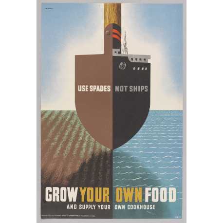
Purpose/Function
Encourage British people to grow own food
It’s a propaganda poster from ww2
Encourage people to plant their own food
Materials and techniques
Sketching on a small scale first
Read the posters from a distance to make them stand out more
Lithography is a printing process which uses a metal plate so multiple versions of the poster can be produced
Market and target audience
dynamic layout and visual puzzle of combining two objects appeals to a wide audience.
Games met the propaganda design brief by making this appeal to a wide audience
Style
These had to work on a small scale and they had to be seen from faraway
‘Maximum meaning through minimal means’
Simple bold and eye catching.
Imagery
Image of a ship and a spade combined, one visual repping two things
Lines and textures help provide a feeling of movement
The poster is split into 4
Layout
A frontal view of the ship
Divided symmetrically in half and is balanced on both halves
A figure of eight shape is created with the ship, the spade and the shadow
Typography
Uppercase sans serif
Simple in style and the ‘your own’ are yellow to directly address the audience
Visual elements
Colour line and tone
Uses primary secondary and neutral colours
Designed around the vertical axis and the horizon line
Visual impact
Intriguing image with 2 meanings
Centered, symmetrical and divided into quarters
‘Your own’ speaks to the audience because it has a brighter colour
Influence 1
Influenced by surrealist art, specifically Salvador Dali
For example in Dalis painting ‘An apparation of a face and a fruit dish on a beach’ we can see a vase but also a face
This double meaning can be seen in the ‘Use spades not ships’ poster
Influence 2
Abram games was Jewish and was aware of the Nazis use of propaganda
He was one of the first to see images of concentration camps
In hundreds of the war posters he made you can see the social conscience that Abram games has and how he thinks he should use his skill for good.